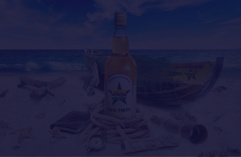
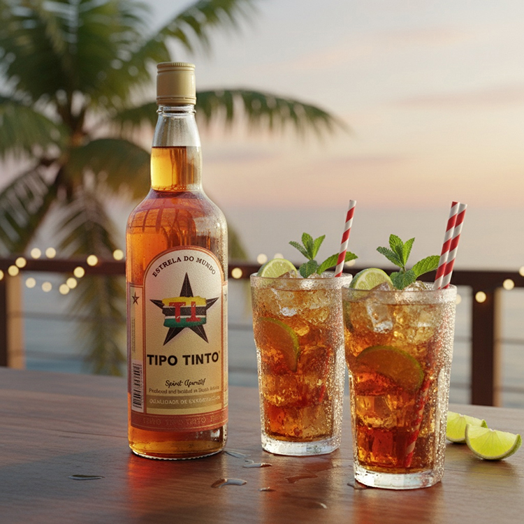
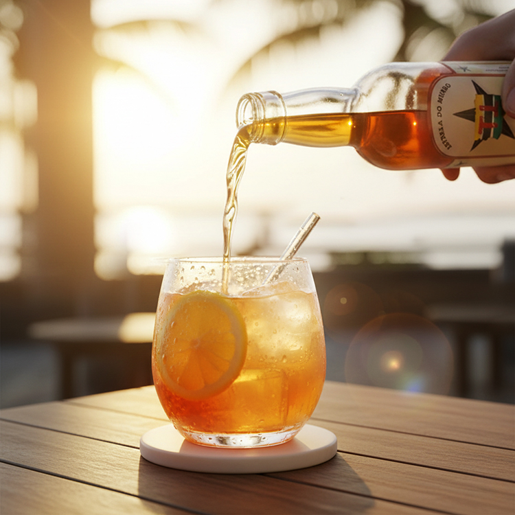
My Solution

I reshaped Tipo Tinto’s flat visuals with print design in mind—retouching each packshot and composing a layered beach scene with authentic details like nets, ropes, and boats. The result was imagery that radiated the brand’s identity across South African campaigns.

My Solution

I reshaped Tipo Tinto’s flat visuals with print design in mind—retouching each packshot and composing a layered beach scene with authentic details like nets, ropes, and boats. The result was imagery that radiated the brand’s identity across South African campaigns.

Before and After

Drag the arrows to see how flat details were retouched into a more vibrant, dynamic composition.

A closer look

The image below gives a closer look at the retouching work done to the Tipo Tinto bottle.

The Result

The final result: cohesive packshots used widely across Tipo Tinto’s print design collateral. With retouching, each image embodies the brand’s adventurous spirit, leaving a lasting impression across markets and audiences.

The Result

The final result: cohesive packshots used widely across Tipo Tinto’s print design collateral. With retouching, each image embodies the brand’s adventurous spirit, leaving a lasting impression across markets and audiences.

Let’s craft something unforgettable.

I deliver logo design and branding that last — fair price, no agency nonsense.
Let’s work together.

Contact me

Let’s craft something unforgettable.

I deliver logo design and branding that last — fair price, no agency nonsense. Let’s work together.

Contact me