Brand Strategy

A Wordmark Built
on Structure

CREC needed an identity that felt connected to the physical, engineered environments in which the business operates. Rather than treating the name as simple typography, the wordmark was developed as a structured graphic element that could give the brand greater recognition and ownership.

This established the foundation for an identity rooted in construction, connection and technical systems rather than generic electrical imagery.

Brand Positioning

Brand Voice + Visual Direction

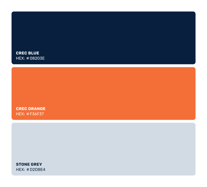
The visual direction needed to feel industrial without becoming heavy, aggressive or overly mechanical. Deep navy creates the primary brand environment, while orange introduces a controlled point of energy and contrast supported by a restrained neutral palette.

Typography and graphic elements extend that approach, giving CREC a visual language suited to technical documentation, equipment, signage and everyday communication.

Brand Positioning

Brand Voice and Visual Direction

The visual direction needed to feel industrial without becoming heavy, aggressive or overly mechanical. Deep navy creates the primary brand environment, while orange introduces a controlled point of energy and contrast supported by a restrained neutral palette.

Typography and graphic elements extend that approach, giving CREC a visual language suited to technical documentation, equipment, signage and everyday communication.

Strategic Direction

Logo Concept + Construction

The symbol was developed from interlocking geometric forms, combining the idea of electrical connection with the structural nature of CREC’s work. The shapes also create a compact visual link to the letterforms within the company name without turning the mark into a literal electrical icon.

A consistent angular construction keeps the symbol closely connected to the wordmark and gives the identity a recognisable visual signature.

Scalability + Clarity

The identity needed to work across very different environments, from large industrial signage and shipping containers to helmets, identification tags and smaller digital applications.

Multiple logo configurations and a simplified symbol allow the CREC identity to retain its character and remain legible without depending on one fixed layout.

The result

A Clearer,
More Distinct Identity

The finished identity gives CREC a recognisable system that can move confidently between industrial sites, equipment, printed material and digital communication.

Instead of relying on familiar electrical industry symbols, CREC now has an ownable visual language that reflects the structure and technical thinking behind the business while giving the brand room to grow.

The result

A Clearer, More Distinct Identity

The finished identity gives CREC a recognisable system that can move confidently between industrial sites, equipment, printed material and digital communication.

Instead of relying on familiar electrical industry symbols, CREC now has an ownable visual language that reflects the structure and technical thinking behind the business while giving the brand room to grow.

Your business deserves
a stronger brand.

Through logotype design and branding, I create distinctive identities
that help businesses look clearer, more credible and easier to recognise.

Contact me

Your business deserves a stronger brand.

Through logotype design and branding, I create distinctive identities that help businesses look clearer, more credible and easier to recognise.

Contact me