Flowt Movement Studio
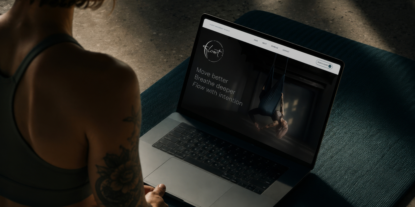
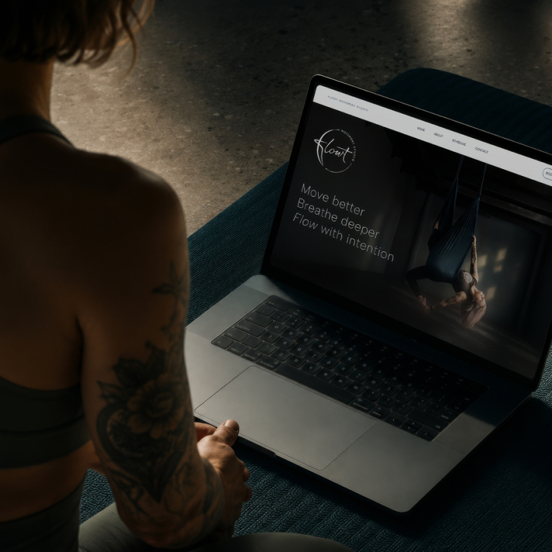
The project brought the positioning, logo, visual identity and website together into one connected brand ready for the studio’s opening and next stage of the business

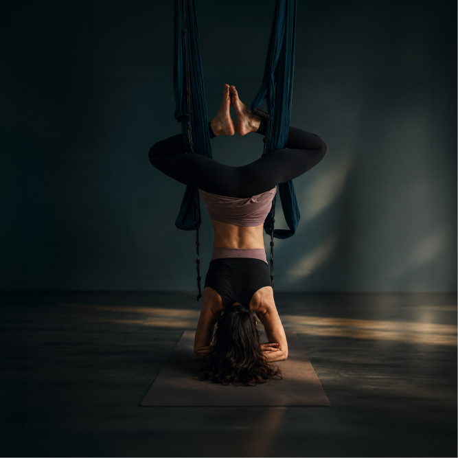
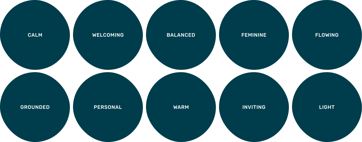
Rather than relying on spiritual yoga clichés or high-performance fitness language, Flowt was positioned as an accessible movement studio for people at different levels. The visual direction balances softness with structure, creating a welcoming studio identity without becoming overly delicate or feminine.
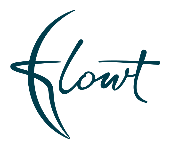
The Flowt logo uses rounded, flowing letterforms to create a sense of continuous movement while remaining easy to recognise. A subtle feather integrated into the F introduces a lighter reference to aerial movement without turning the identity into a literal yoga or fitness symbol. This gives Flowt a mark that can represent the entire studio rather than one type of class.
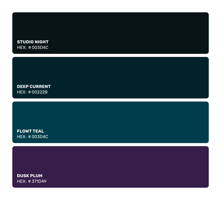
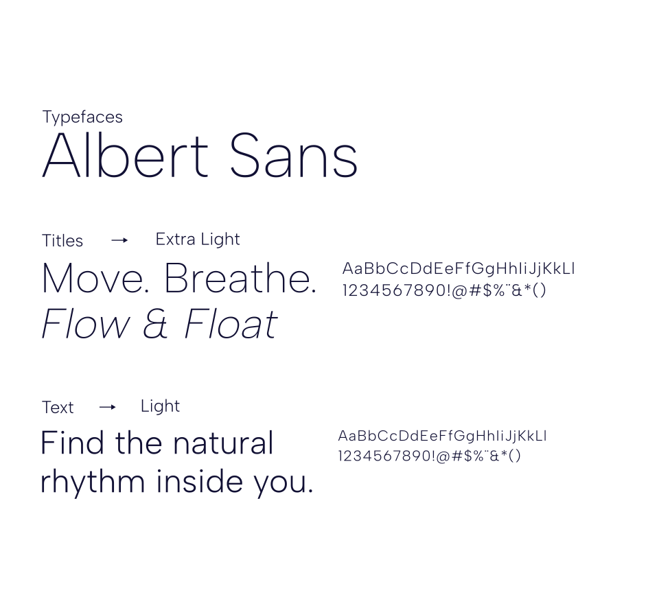
From studio signage and class schedules to social content, print and the website, the identity was designed to stay consistent without relying on the logo alone. Typography, colour, imagery and layout create a flexible visual language that can adapt to different classes, promotions and future additions to the studio.
A complete branding and brand identity system that takes Flowt from a yoga-led business into a studio brand with space to evolve. The logo, website, imagery, typography and colour now work together across every customer touchpoint, giving the business a consistent foundation for its opening, ongoing classes and future growth.
Sandra Leigh – Flowt Movement Studio
Whether you need branding and brand identity, website design, retouching or print, I’ll help your business build a clearer, more cohesive visual presence.